
Here at Meadows and Byrne, we are big believers in timelessly beautiful and smart design, so we have been looking at how to trend responsibly and still have fun with your interiors.
We are looking at 3 key trends for the coming season: Neutrals with a difference- this trend focuses on texture and muted tones, Bold Colour- this trend was massive at every show and is hugely energizing, and finally we will be looking at Pantone’s colour of the year; Living Coral.
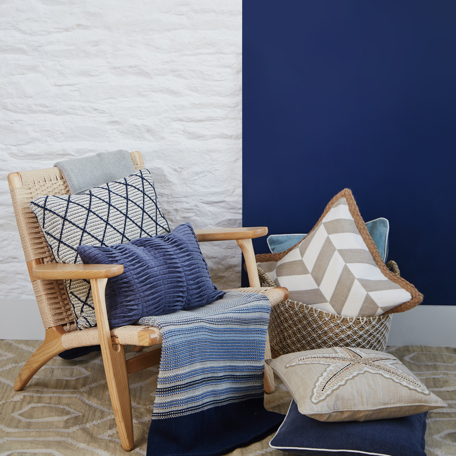
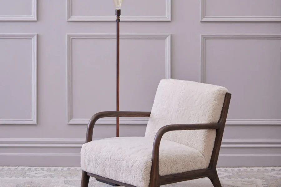
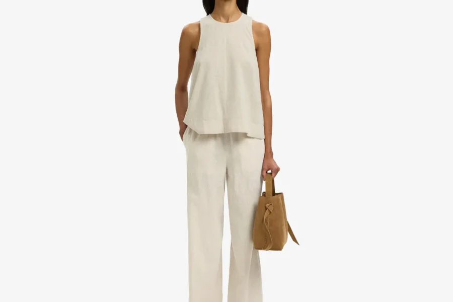
Neutrals with a difference.
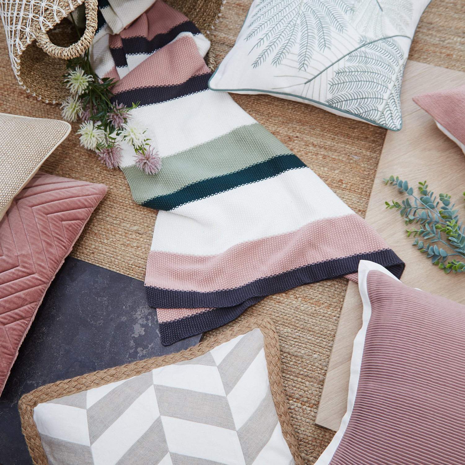
Natural, simple and useful pieces which satisfy a yearning for calm and honesty. This trend features natural linen tones, with subtle tones of pink, blue and green, and a respect for texture and materials.
Here at Meadows and Byrne we are doing a colour story of Pacific Mist, which features a range of drifty denim blue tones with textured linen and jute cushions, which embodies the serene feeling this trend focuses on.
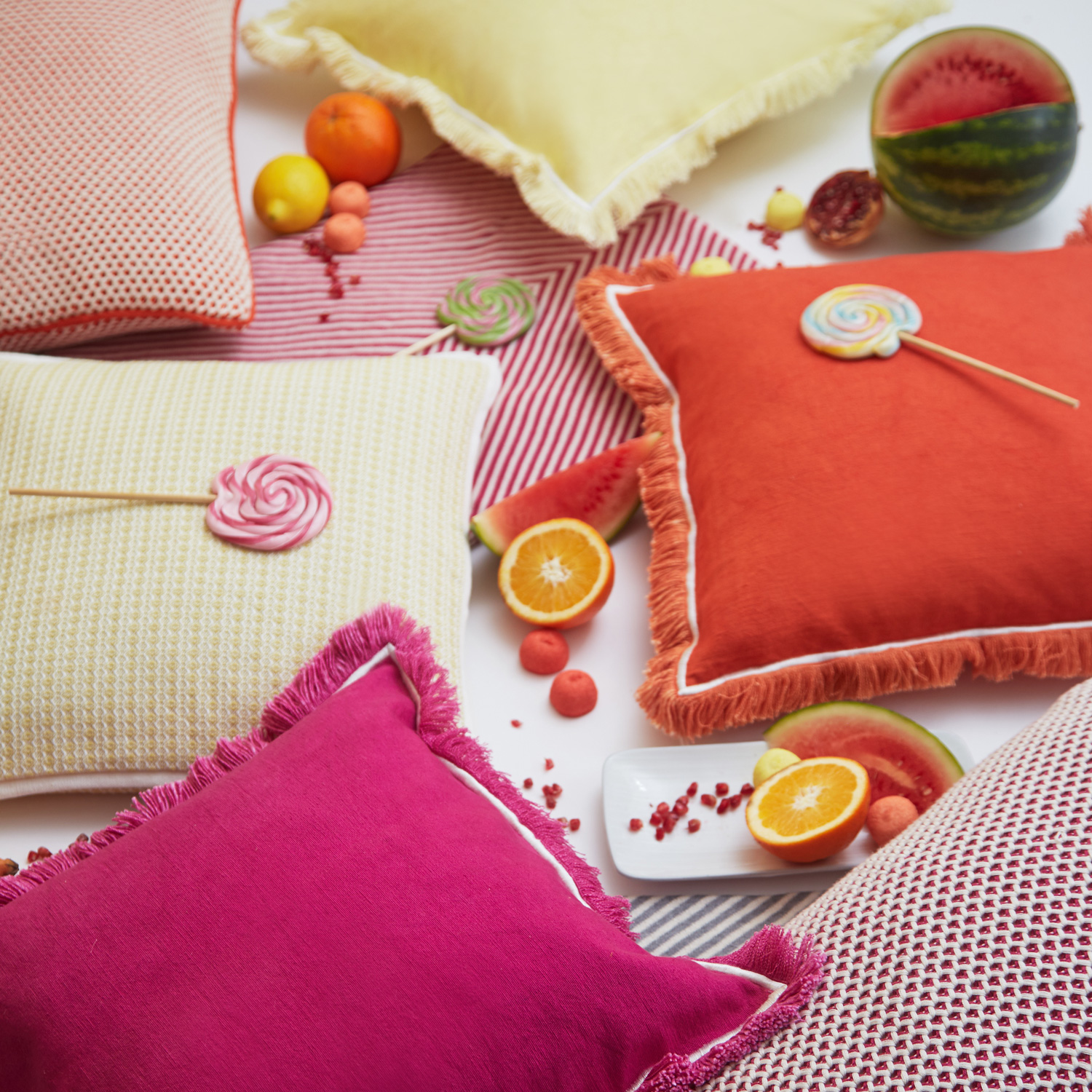
Bold Colour
Grey has been a key colour in interiors for the last few years, being very dominant in kitchen and paint choices all around the country, but as is the nature of trend, we are all in need of a little change! We have seen a huge emergence in bold colour over the last 3 years in design globally, however it is clear from the recent Interiors shows that the playful colour we have seen is here to stay.

Our vibrant soft furnishings offer allows you to incorporate this trend of strong colour by layering statement pieces in your room. This way you can hang onto your more neutral paint colours and large furniture pieces, while still enjoying this energetic trend.
Our Popsicle range is vivacious and is sure to lift any room. The colours are inspired by the vibrant colours of exotic fruit and have a candy quality to them that is immediately energizing- such a fun range.
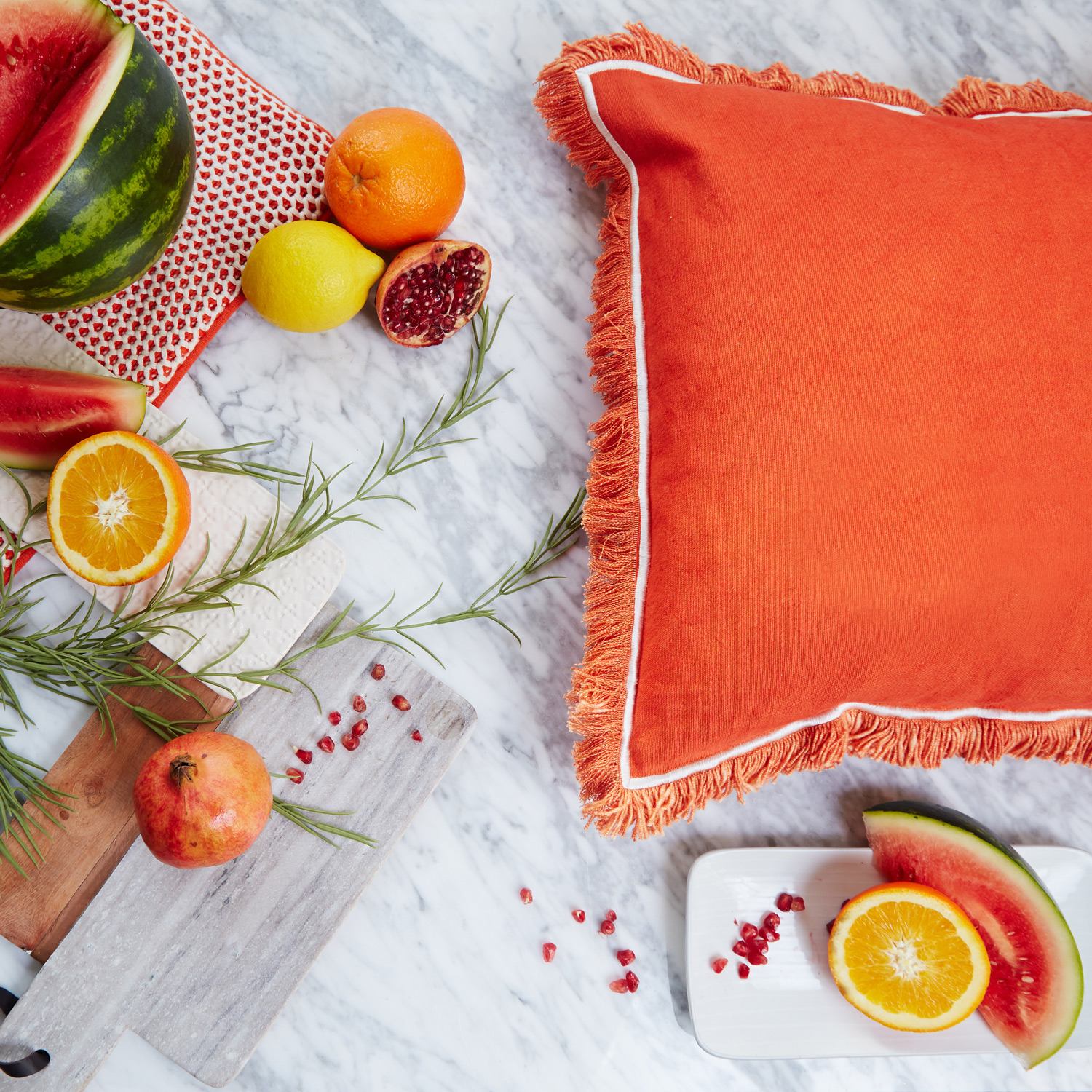
Living Coral
“An animating and life-affirming coral hue with a golden undertone that energizes and enlivens with a softer edge.” The idea of the Living Coral is very tied into the neutral trend spoken about previously and also is of a similar ethos to the Dulux colour of the Year; Spiced Honey. These warm tones are all about being versatile and influencing the mood of interiors.
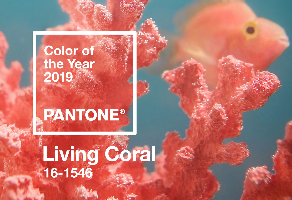
As part of our Popsicle range, our Tangerine cushion offers this warm hue which is certain to enhance the atmosphere and add an instant lift to any room.
Our soft furnishings collection for Spring/Summer 2019 includes cushions, throws and tabletop textiles and will be launched exclusively online on Feb 1st, with in-store availability from the Monday 4th of February on.
Leave a Reply